What is Google Sheets Canvas? Turn Your Spreadsheet into an Interactive Dashboard
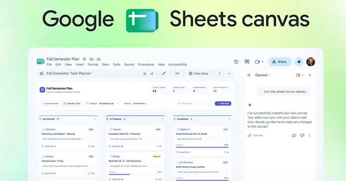
Google Sheets just rolled out Canvas — a game-changing feature that lets you transform boring rows and columns into gorgeous, interactive visual dashboards. Think of it as turning static data into a living, breathing management tool.
Anyone who's spent time squinting at endless spreadsheets knows the pain. Rows of numbers blur together. Patterns hide. Context gets lost. That's where Sheets Canvas steps in, powered by Gemini AI. It converts your data into interactive, customizable visualizations. Here's what makes it special: you don't need coding skills. Just describe what you want in plain English, and Canvas builds it for you. Let's dive into how it works.
What Exactly is Google Sheets Canvas?
Canvas takes data from your spreadsheet and morphs it into an interactive visual interface — think dashboards, Kanban boards, study trackers, or seating charts. The magic part? When you update your source data, Canvas updates automatically. Here are some real-world applications:
- Project Management: Convert task lists into Kanban boards, monitor progress, or build project dashboards.
- Education: Create study trackers to manage subjects, assignments, deadlines, and completion rates.
- Event Planning: Transform RSVP lists into guest management interfaces or seating arrangements.
- Sports Analytics: Track players, stats, positions, and rosters for fantasy football leagues.
- Personal Finance: Visualize income, expenses, and savings at a glance.
- Sales & Business: Build sales dashboards, track customers, monitor KPIs, or manage pipeline opportunities.
How to Use Canvas in Google Sheets
Important: Switch your Google account language to English to access this feature.
Step 1:
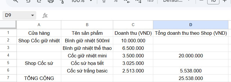
Start with a prepared dataset. Even a simple, rough table works fine.
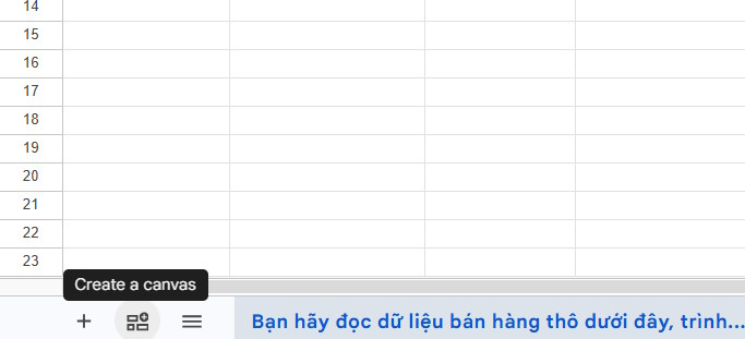
Next, click the Canvas creation icon at the bottom of your screen.
Step 2:
A chat panel with Gemini appears on the side. Here's where you write your request in English using this formula: Data + Layout + Information to Display + Interaction Method.
Be specific about:
- What you want to turn your data into
- How you want to group the data
- Which information matters most
- What should stand out in the interface
For the sample table above, here are some effective prompts:
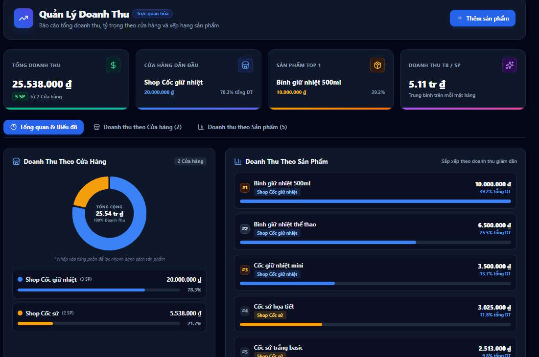
Create a revenue dashboard by shop and product, showing total revenue, revenue for each shop, and a comparison chart.Create a visual revenue dashboard showing total revenue, revenue by shop, and revenue by product.Turn this spreadsheet into an interactive sales dashboard with revenue by shop and product.Turn this spreadsheet into a visual revenue management app with total revenue, revenue by shop, and revenue by product.Step 3:
Wait a moment, and Gemini generates a mini app with a polished, interactive interface. It works just like Canvas in Gemini itself.
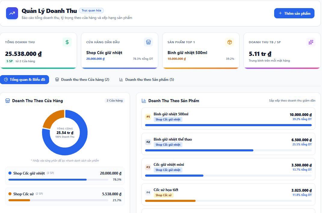
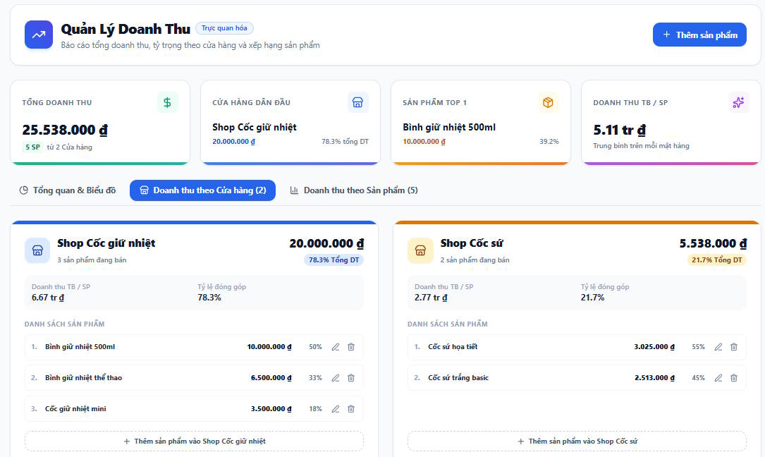
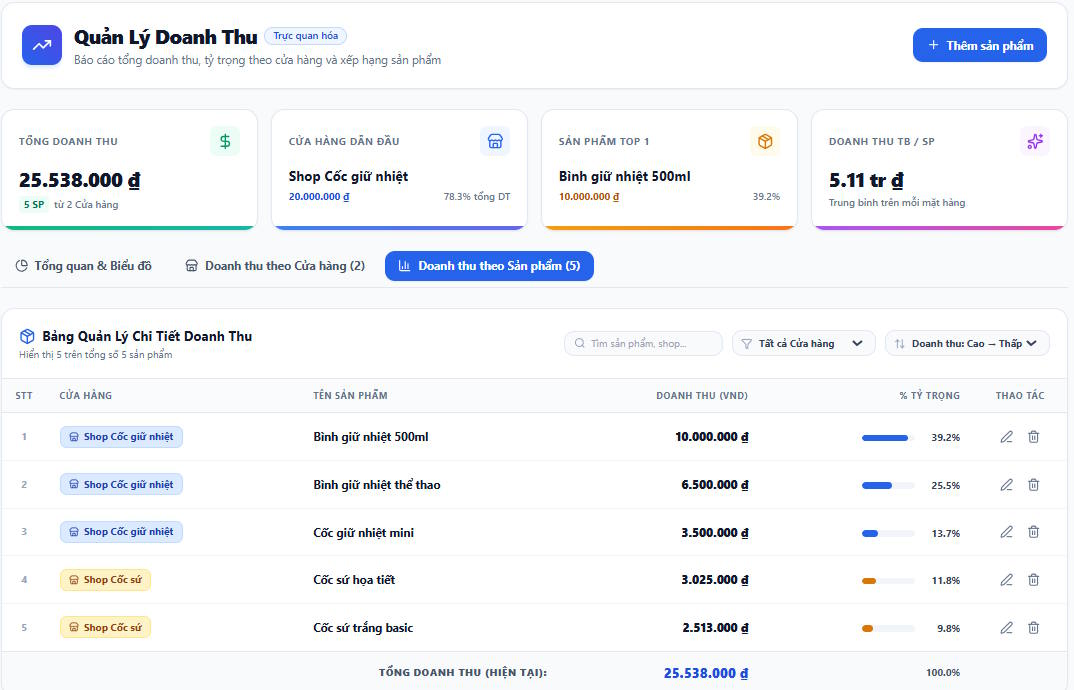
What's interesting here is how professional the result looks, even with a basic underlying dataset. The layout is logical, well-organized, and actually usable. Different data sources will generate different layouts automatically.
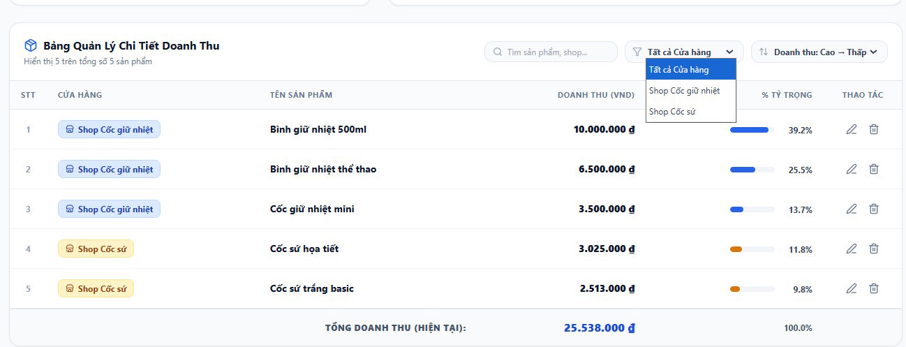
With a detailed revenue management dashboard, you can edit products, search entries, and make direct changes to your underlying data. The visual updates instantly.
Step 4:
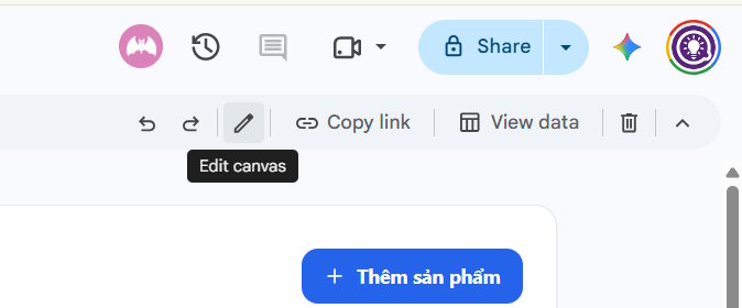
Click the edit icon (pencil) at the top to refine your dashboard through Gemini. You can also share the dashboard via link. Hit "View data" to return to your spreadsheet.
Want a tighter, cleaner layout? Try this:
Make the dashboard more compact and easier to scan.Need to reorganize how data groups together?
Group the tasks by Project instead of Status.Want an overview section up top?
Add a summary section at the top showing total tasks, completed tasks, and overdue tasks.Looking to emphasize urgent items?
Make high-priority tasks visually prominent.Ready for a theme change? Try switching to dark mode — the interface updates instantly.
Keep refining until Canvas matches your workflow perfectly.
Canvas Prompt Formulas & Examples
Craft your Canvas requests using this template, adjusting based on your data and goals:
Create a [app type] from this spreadsheet. Organize the data by [criteria]. Show [key information]. Add [features/interactions]. Make the interface [desired style].
Here are real-world examples:
Project Management Dashboard
Create a project management dashboard from this spreadsheet. Organize tasks into a Kanban board with three columns: Not Started, In Progress, and Completed. Each task card should show the task name, project, priority, and due date.Create a project management dashboard from this spreadsheet. Organize tasks by Status. Show the task name, project, priority, and due date. Highlight high-priority tasks and make overdue tasks easy to identify.Assignment Tracker
Create a visual study tracker from this spreadsheet. Organize assignments by subject and status. Show upcoming deadlines prominently and make completed assignments easy to identify.Content Schedule
Create a content calendar from this spreadsheet. Organize posts by publication date and status. Show title, platform, content type, and owner. Make upcoming posts visually prominent.Personal Budget Tracker
Create a personal finance dashboard from this spreadsheet. Group transactions by category and month. Show total income, expenses, and savings. Highlight unusual expenses and make the dashboard easy to understand.Description: Google Sheets Canvas transforms raw data into stunning interactive dashboards. Learn how to create visual management tools without coding.
Related Articles
- How to Use Google Sheets AI Summarize to Condense Your Data
- Best AI Image Upscaling Tools to Boost Your Photo Resolution in 2026
- Claude vs ChatGPT: Which AI Chatbot Should You Actually Use?
- Meet Muse Glimmer: Meta's Open-Source Agent AI That Runs Entirely on Your Device
- 10 Strategies to Future-Proof Your Career in the AI Era

No Comment to " What is Google Sheets Canvas? Turn Your Spreadsheet into an Interactive Dashboard "